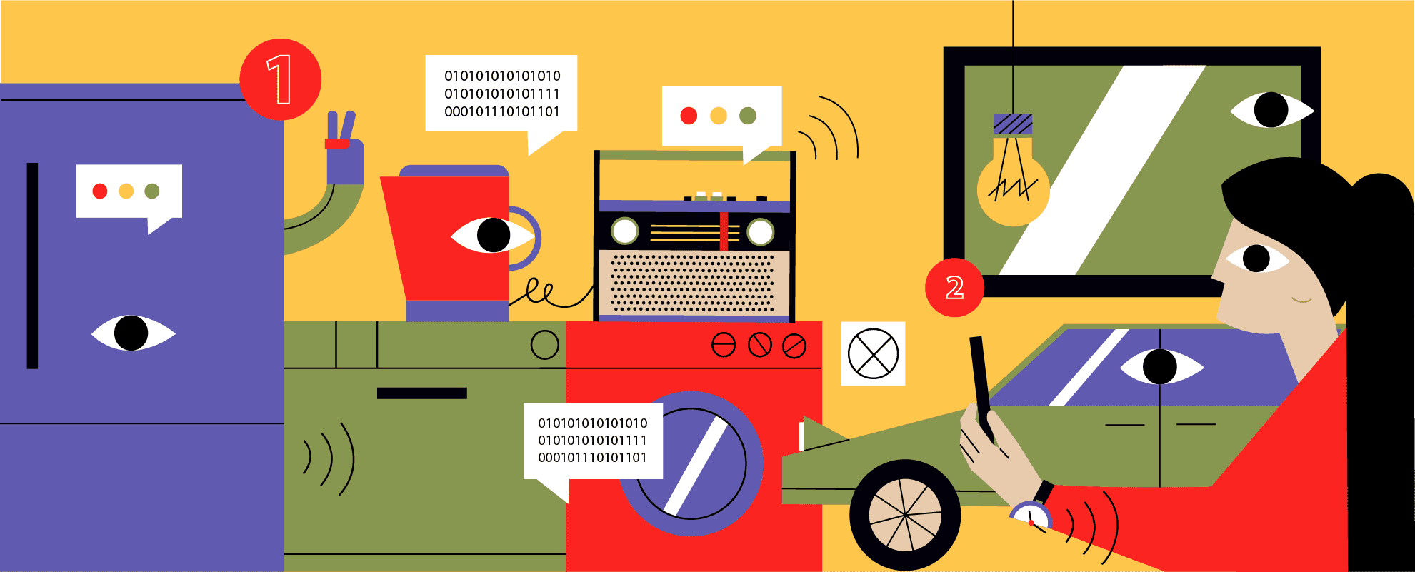
Experience design in the connected world of IoT is a whole new ball game for designers to tackle. The fundamental difference compared to UX design for standalone digital products lies in the three-dimensional nature of an IoT world.
An incredibly diverse range of devices is now connected to the internet - including wearables, home appliances, vehicles, and gadgets. These “connected things” come in different shapes and sizes - some of them don't even have a screen and the physical UIs are typically limited. Often times, the UIs of these devices are designed and developed separately in the form of smartphone apps that enable us to control and interact with our IoT devices remotely.
No matter the type of device we’re interacting with via an app, we want to feel like we are using a unified service and this represents a unique challenge for UX and interaction designers. They now need to understand far more about the users’ needs in a specific context of use in order to create new digital-to-physical workflows or successful “connected” experiences.
IoT demands that UX designers work more collaboratively with other designers, software and hardware engineers, and product strategists within the group in order to create seamless interactions between users and connected objects.
Apps in IoT Have a Different Function
Standalone mobile and Web apps are designed with a goal of attracting and retaining people’s attention. Their key success metrics are things like time spent in app, number of key features used, etc. In an IoT world, apps are designed and built to amplify a real world experience. It's less about app usage now, and more about the enablement of a coherent service.
However, like traditional web and mobile applications, IoT apps should follow the principles of UX design including usability, simplicity, efficiency, ease of use, and learnability to enable frictionless connection with an object whether it be a connected home tech, a wearable, or a connected car.
Lessons We Learned while Designing UX for a Smart Car App
IoT holds a considerable promise for many industries, and the possibilities are truly endless. For example, automotive, transportation and logistics industries are already being disrupted by the emergence of the connected vehicles, automotive telematics systems, and digital platforms.
Automakers are now competing on delivering functional connected car experiences for the end users. Transportation companies are using IoT devices to track their fleets, check on vehicle condition, and examine driving behavior.
At SpiceFactory, we’ve worked with a number of clients to create effective UX/UI design for connected car apps and we’ve learned some important lessons along the way which may not be so obvious to UX teams who are just starting out with the design for IoT products.
Focus on Familiarity and Simplicity
When our team was tasked to design a smart car app that would enable users to remotely lock, unlock and start their vehicles, the main goal was to find a design solution that would connect drivers with their cars in a way that feels familiar to them.
Today’s consumers want simple solutions to their problems, so digital products have to be easy to use and learn. When experiencing a new kind of interaction a user might feel like they are stepping on an unknown territory where their previous knowledge of interactions with a UI (typical operating systems on personal computers, mobile devices, etc.) cannot be applied to this new piece of technology. We are aware of the trends in the industry, and IoT interactions might seem obvious and straightforward to us, but not to the end user.
To bridge this gap we have decided to use a familiar interface which will make the user more confident in predicting the outcomes of their interactions with the app. The user must be sure that once they tap the “Smart Start” button the car engine will start.

Prototype, Test, and Iterate Rapidly
We practice iterative design for all our projects, but for an IoT app, it's even more important to follow this process to quickly get to a user-validated design that meets both client and user requirements. Creating interactive prototypes and testing them with real users really helps a designer understand the experience a user goes through while interacting with an app and how it connects to their real-world experience of interacting with a connected device.
The user interface to a Smart Car App was tested with real users and refined through multiple iterations. We used a prototyping tool that helped us work faster and user test the UI to uncover and fix usability issues early on.
Takeaways
Each IoT design project will have its own specificities, and there are no universal rules for a designer to follow. As an emerging field, UX design for IoT will be a process of trial and error.
However, there are some basic best practices that are useful to know and adapt to a product you’re working on. In short - keep users’ needs in a specific context of use front and center, design to enable a unified service, rely on the principles of UX design, focus on familiarity, and iterate until you get to the final, user-validated solution.
