PWAs: When a Website Can Replace Your App
This article will look into the details of building and optimizing a progressive web applications (PWA) for native-like look and feel.
We wrote about PWA vs. native app development for a more general overview of the advantages of each. Hint - PWAs are cool for most cases, React Native is an excellent cross platform choice that compiles to native code, and if you are building an app that relies on all the sensors and needs to be super small and optimal, native code is the way to go (though you can combine it with React Native UI).
This article will look into the details of building and optimizing a progressive web applications (PWA) for native-like look and feel.
Apps should be installed and sit on the home screen
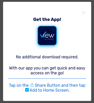
When a user lands on the web page, they should be aware that there’s an option to add the app to their device’s home screen. Android provides a way for web developers to “install” the app for the user so that the experience is seamless.
Unfortunately, iOS still doesn’t provide this option but it supports PWAs and users can add the app to the home screen with some manual work. If we detect that a user is accessing the app from mobile, we display instructions for adding the app to their device home screen.
With an active service worker, when added to the homescreen the PWA loads faster and works offline and on low quality networks.
App name and icon
Web manifest is where you define icons and app name (for most platforms - desktop, Android, but not iOS). iOS requires icons to be defined in the head section of the app, more in the Safari Web Content Guide.
Keep in mind that you will need to generate icons for all resolutions. Fortunately, there are many resources online to help you generate all the app icons you’ll need ( hint - Google app icon generator).
Don’t forget to set short name - this is what will be shown below the app icon. Try to keep it under 12 characters to avoid truncation.
Header:
<meta name="apple-mobile-web-app-title" content="View" />
Web manifest:
"short_name": "View"
Hide the web browser's UI, like URL and status bar
Web manifest specifies display property where you can control the browser UI. There are a few options available: fullscreen, standalone, minimal-ui and browser.
And add to web manifest file:
"display": "standalone"
iOS Safari is not respecting web manifest, but provides another option to indicate that the browser UI should be hidden. Add to the html head section the following:
<meta name="apple-mobile-web-app-capable" content="yes" />
Avoid flashing background while the app loads
By setting the theme-color it would indicate to the browser to render background color of the app while it loads so that the user doesn’t see flashing app from the white background.
Header:
<meta name="theme-color" content="#000C3F" />
Web manifest:
"theme_color": "#000C3F", "background_color": "#000C3F"
Status bar
Having different color of the app background from the status bar might not be the most visually appealing option. There are a few options here - choose the one you want (black, black-translucent and default).
If you would like to follow the background of the app, use the following in the head section:
<meta name="apple-mobile-web-app-status-bar-style" content="black-translucent" />
Add splash screen
This is super important because it will completely change the experience of the app. When mobile OS starts your app it needs to initialize web renderer which takes some time and user can experience screen flashing. This is where splash screen image comes in to hide the loading in the background and let the user directly into the app experience.
Android has built in mechanism to generate the splash screen, but iOS requires all the resolutions (portrait and landscape for all the different form factors your app would run on). It can be specified in the head section of the html:
<link
  href="iphone11_splash.png"
  media="(device-width: 414px) and (device-height: 896px)
    and (-webkit-device-pixel-ratio: 2)"
  rel="apple-touch-startup-image"
/>
<link
  href="iphone11pro_splash.png"
  media="(device-width: 375px) and (device-height: 812px)
    and (-webkit-device-pixel-ratio: 3)"
  rel="apple-touch-startup-image"
/>
<link
  href="iphone11promax_splash.png"
  media="(device-width: 414px) and (device-height: 896px)
    and (-webkit-device-pixel-ratio: 3)"
  rel="apple-touch-startup-image"
/>
...
<link
  href="iphone11_splash_landscape.png"
  media="(device-width: 414px) and (device-height: 896px)
    and (orientation: landscape) and (-webkit-device-pixel-ratio: 2)"
  rel="apple-touch-startup-image"
/>
<link
  href="iphone11pro_splash_landscape.png"
  media="(device-width: 375px) and (device-height: 812px)
    and (orientation: landscape) and (-webkit-device-pixel-ratio: 3)"
  rel="apple-touch-startup-image"
/>
<link
  href="iphone11promax_splash_landscape.png"
  media="(device-width: 414px) and (device-height: 896px)
    and (orientation: landscape) and (-webkit-device-pixel-ratio: 3)"
  rel="apple-touch-startup-image"
/>
Did you notice how landscape splash screens need to be specified as well, and that device width and device height are the same just orientation:landscape is added?
Play around, try it out on all of the devices you would like your web app to run to achieve desired results.
<figcaption class="text-center">No splash screen</figcaption>
With splash screen
Native-like touch experience
Tapping links in the mobile browser renders a gray highlight - common for web pages but odd for mobile apps. In order to disable it use the following css:
@media (max-width: 991px) ... -webkit-tap-highlight-color: transparent;
Instead of relying on the highlight effect, add custom touch effect using CSS. There is a trick to keep the links display :hover and :active effects when tapped - include empty “ontouchstart” attribute on the body element and voila - pure native button effects.
<body ontouchstart=""></body>
Text selection - only where appropriate

Native apps do not provide text selection as the web browsers do, e.g. buttons labels should not be selectable, etc.
-webkit-user-select property allows control of the selection behaviour. Probably you want this only on mobile, so put it under media query.
-webkit-user-select property allows control of the selection behaviour. Probably you want this only on mobile, so put it under media query.
@media (max-width: 991px) -webkit-user-select: none;
Disable callouts and link highlighting
Doing a long press on the link in iOS would open up the callout menu and we do not want that in the mobile app for every link. If links need to be copied or shared, good practice here is to implement custom dialog
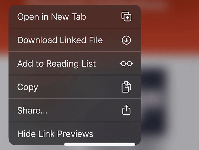
To disable it add the following CSS
@media (max-width: 991px) -webkit-touch-callout: none;
iOS overscroll and bounce effect
It is expected that the mobile app covers the whole screen and that touch scrolling should scroll only the content of the app and not it's headers. However default behaviour for mobile web is to allow overscroll - inside the web browser, this is fine, but for the app this is not expected.
The behaviour comes from the default scrolling effect for touch screens on Safari. In order to avoid it set webkit CSS property -webkit-overflow-scrolling to auto.
-webkit-overflow-scrolling: auto;
This will prevent ios bounce effect but may introduce side scrollbar. Here is a trick to hide it:
@media (max-width: 991px) *::-webkit-scrollbar {
  width: 0px;
}
Mobile app optimized components
However, this is just a start as you should design the entire app with mobile support in mind so that the UI is responsive or adapts and uses mobile-optimized views (e.g. listview instead of a table etc.). Here are a few examples:
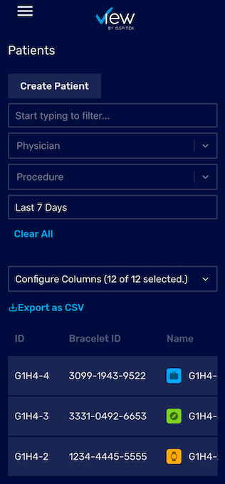
12-column table doesn’t work very well for mobile view, let's try to focus on the most important information.
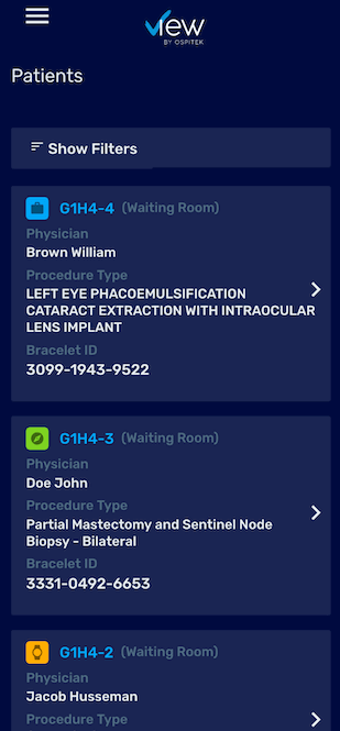
List view is much more appropriate for mobile view.
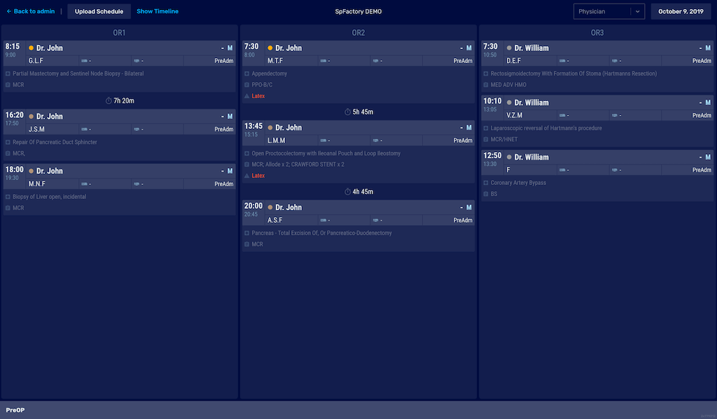
Dynamic, detailed schedule on desktop. It works perfectly on smaller desktop sizes and large TVs. However, it is difficult to use on mobile.
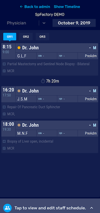
Schedule adjusted for mobile view where the focus is on a single column. To navigate between columns, a tab-like navigation is much better choice for the native-app feel.
Search for cross platform mobile development solution
If you are building for the web, you’re probably aware of the PWA (Progressive Web Apps) hype. For years developers have been trying to find the best cross-platform framework that would allow them to distribute apps from a single code base.
Many of the frameworks that came out did not deliver the experience needed, like Adobe Flex/Air mobile runtimes, and Xamarin. Then Apache Cordova/PhoneGap emerged as a native wrapper to allow engineers to use JavaScript to create cross-platform mobile apps, and it created a plethora of mobile-first javascript frameworks.
This was the age of jQuery and mobile devices were still catching up with performance and the experience was not in place. Native code still outperformed JavaScript applications.
Mobile devices CPUs progressed a lot over the years and rendering web is not a big issue anymore. This was good timing for progressive web applications to be released as a way to provide native-like mobile experience for web applications.
Related Insights

Insight
Why We Chose React Native for Mobile Development
Native vs. cross-platform? We chose React Native to build value-driven products faster. Learn how to cut development costs without sacrificing user experience.
Read More
Insight
Why Mobile Apps Will Not Matter Anymore
Are mobile apps becoming obsolete? As AI and chatbots redefine user interaction, the focus shifts from mechanics to utility. Discover what replaces the traditional app economy.
Read More
Insight
Technology trends for 2020
Software engineering is evolving fast. As 2020 approaches, we anticipate the end of antipatterns like the "10x engineer." Explore how culture and tech are shaping the future.
Read More
Insight
Keep Your SEO Ranking When Changing Your Site Structure or Moving to a New Domain
Redesigning your site? Don't risk a drop in indexed pages. Discover how to change your site structure or domain while keeping your hard-earned SEO ranking intact.
Read MoreShipping production AI into a regulated industry?
Tell us the regulatory or safety constraint slowing you down. 30 minutes with a senior engineer, a deployable architecture sketch, and an honest call on whether a Bootcamp is the right next step.