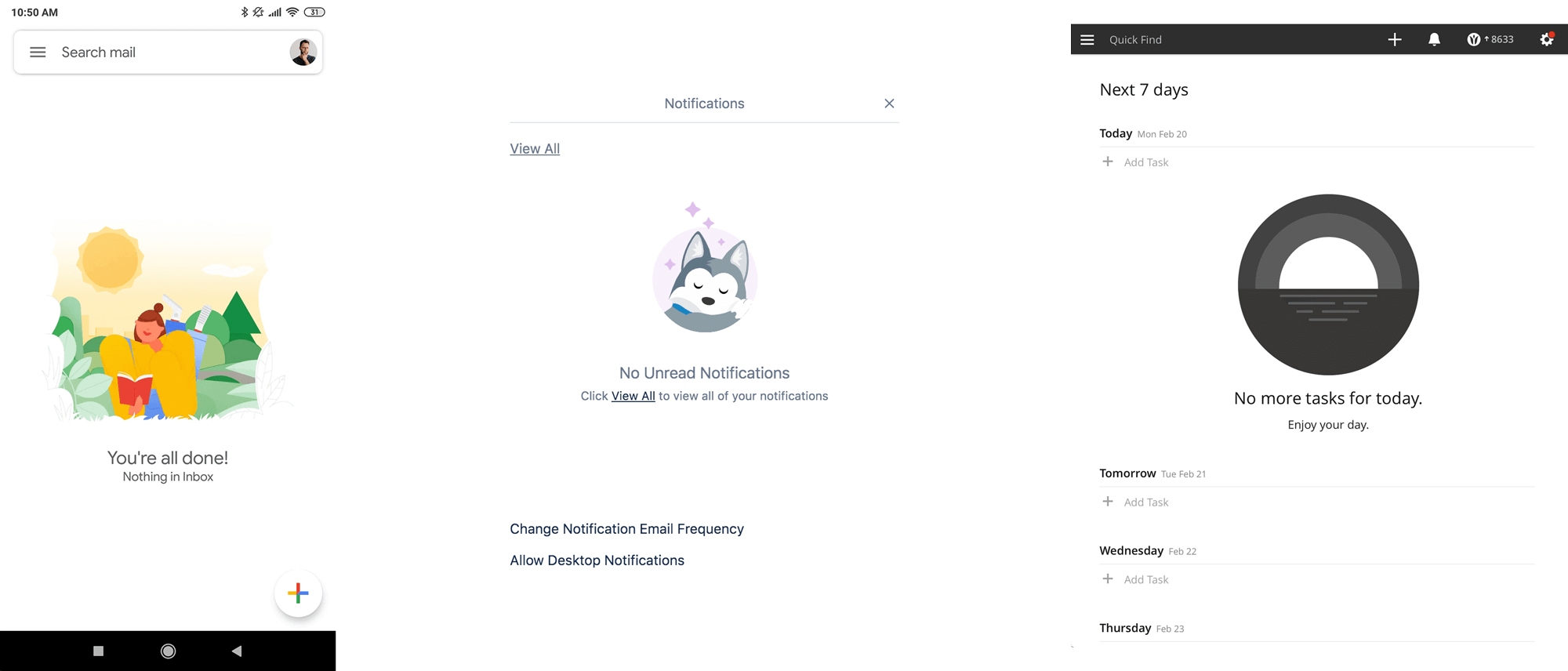
Gmail, Trello and Todoist examples of empty states
By designing the empty state you avoid confusion, frustration and the perception that your application might not be working properly.
Sounds depressing, right? Quite the contrary. Properly addressed empty state can improve UX tremendously. Empty state occurs when interface has no content to show. Think of an empty table, a list without a single list item or a blank sheet of paper. By designing the empty state you avoid confusion, frustration and the perception that your application might not be working properly. Not only will you alleviate the negative feelings from encountering the no-content but even turn it into a positive experience. Empty state can reward you for being tidy.
Gmail, Trello and Todoist examples of empty states
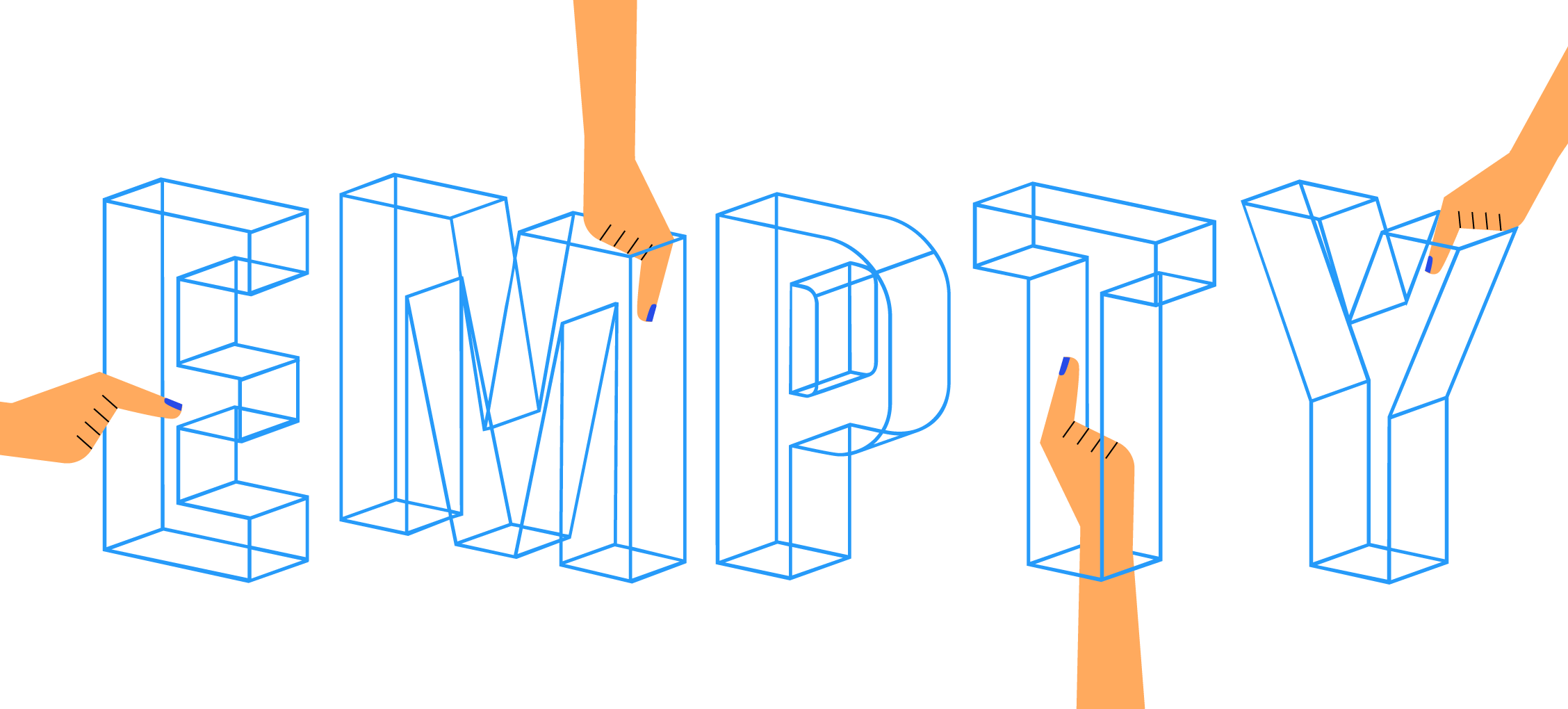
It can ease the pain when things do not work out.
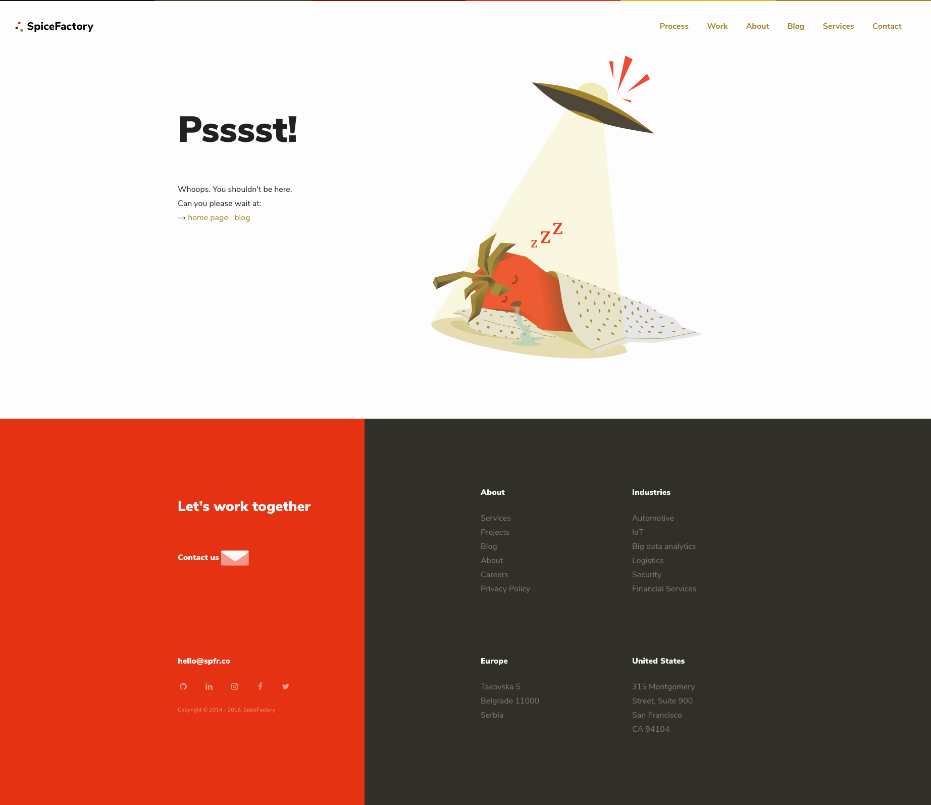
SpiceFactory 404 not found page
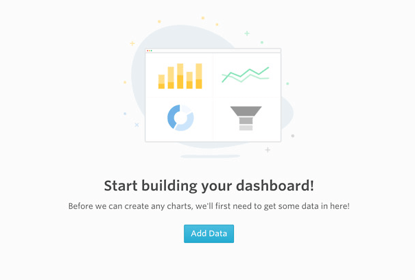
Or prompt you to perform an action.
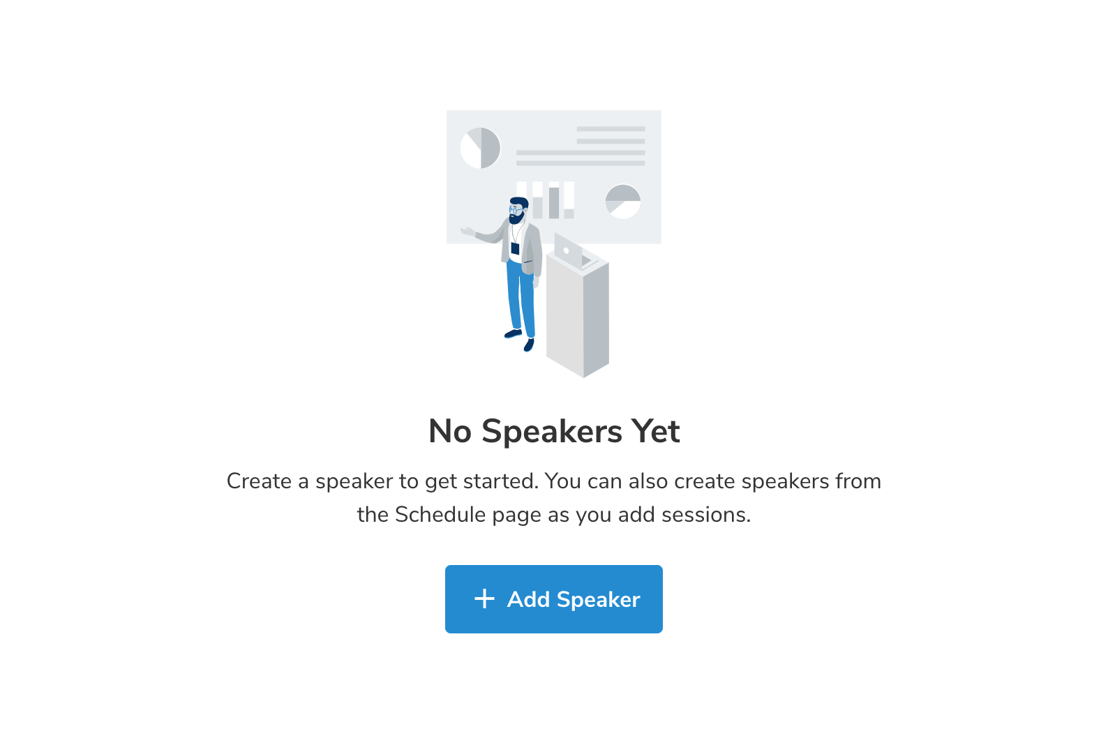
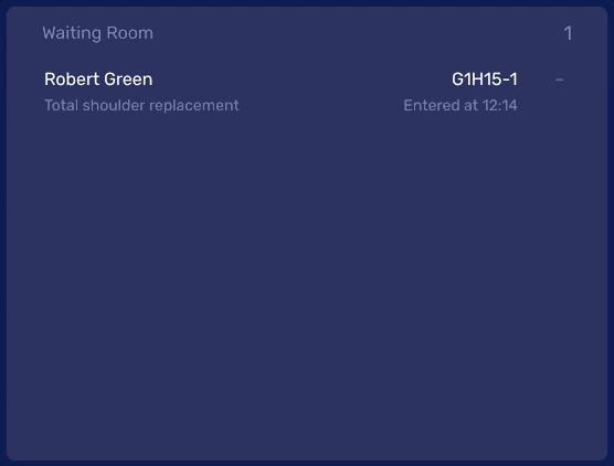
No speakers empty state in Sava Events app
No dashboards in Visible.vc
At SpiceFactory, empty state is an integral part of our product development process. It has become a second nature of everyone involved in the development of the product to think about how the element will look and behave without any content.
Here’s how we approach the empty states.
Illustrations are a great way of bringing more vibrancy to the empty interface. Also, it is a great way to communicate complex messages or simply make them more clear.
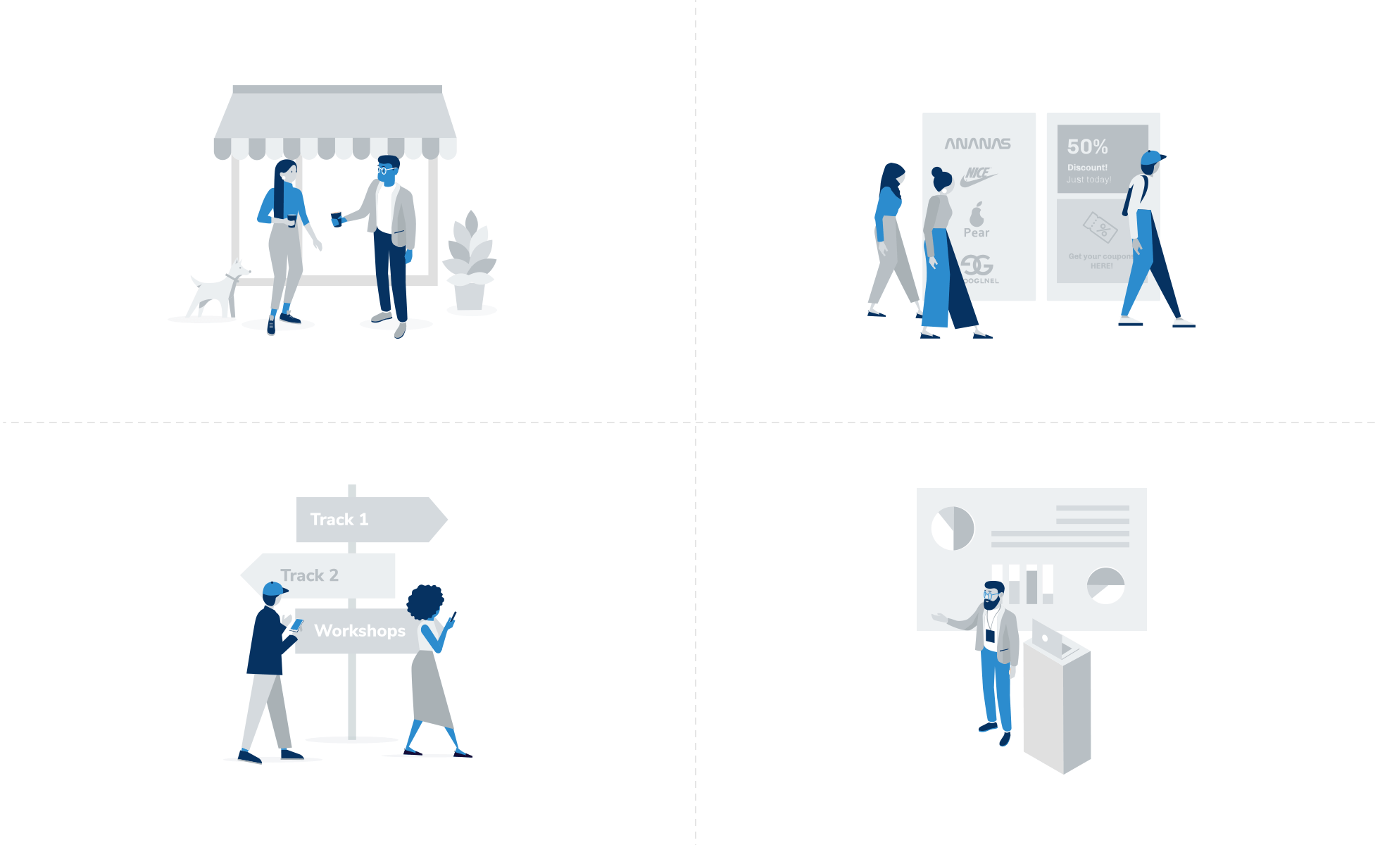
Series of illustrations of different empty states in Sava Events app
We always make sure that we are using a proper and consistent tone in empty states. This applies to both copy and imagery that accompanies it. Some products would benefit from a more serious tone while others welcome playfulness and humour. The tone is also reflected in the animations and transition speeds.
An example of transition to an empty state in View
Empty state should always communicate clearly what is going on. That is its primary and most important purpose. Let your users know what is going on.
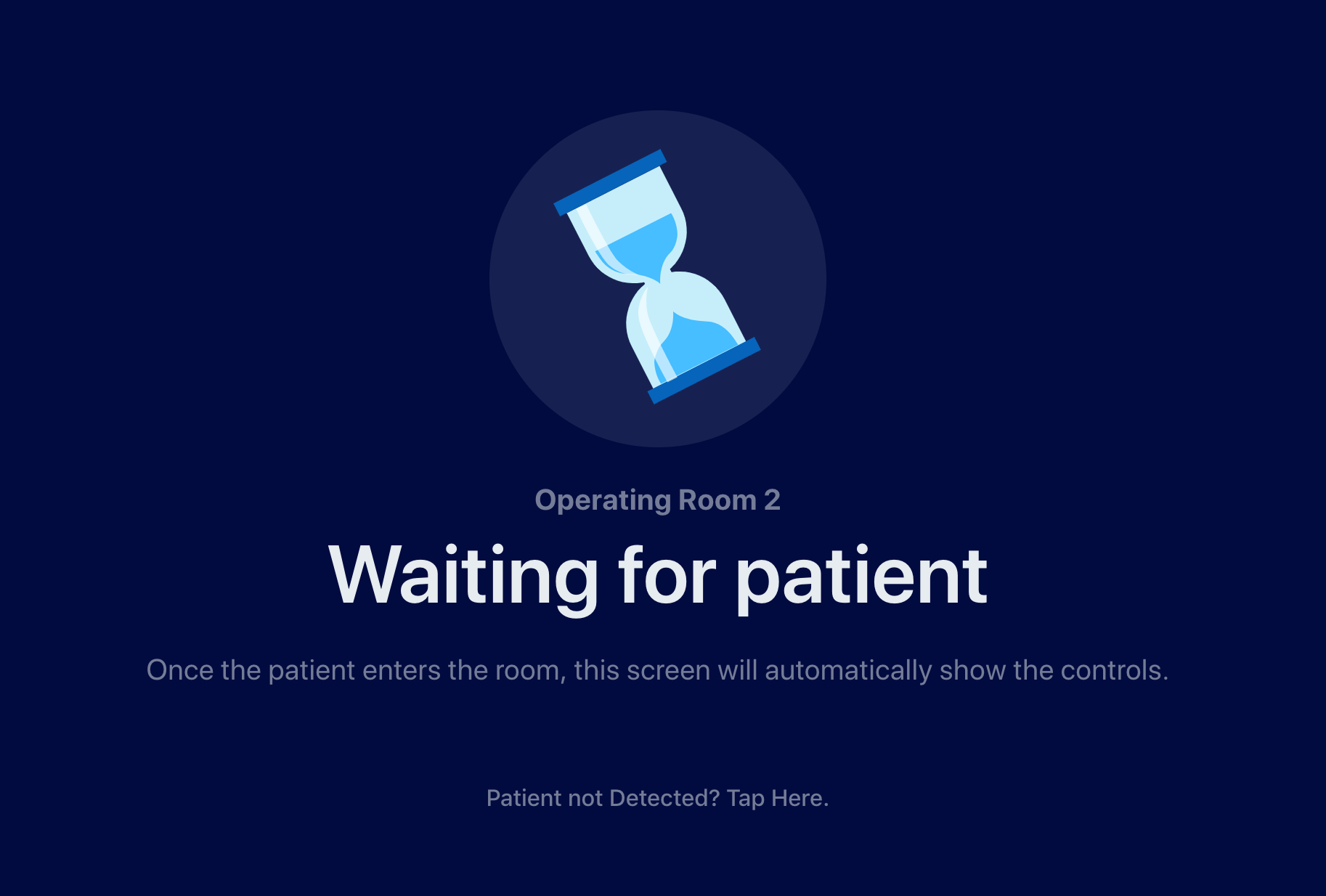
When View system awaits for the patient to enter the OR
At the end of the day, the most important step is to acknowledge the emptiness. Your users will face it at some point. Let the interface communicate what is going on and what is expected of them to do next.
Never leave your users in the dark.

Insight
Illustrations in UI are more than just decoration. They clarify complex ideas and build emotional connections with users. Discover how visuals elevate your product experience.
Read More
Insight
Master the art of UX writing to boost user engagement. Learn how to craft compelling microcopy that builds trust and guides users seamlessly through your digital product.
Read More
Insight
Stop users from bouncing instantly. Effective visual hierarchy is key to guiding attention through the noise. Discover how to improve your UX design and keep visitors engaged.
Read More
Insight
Think empathy is just for designers? Think again. Discover why empathy-driven design is the secret ingredient for engineers and designers building impactful digital products.
Read MoreLet's discuss how we can help transform your vision into reality.