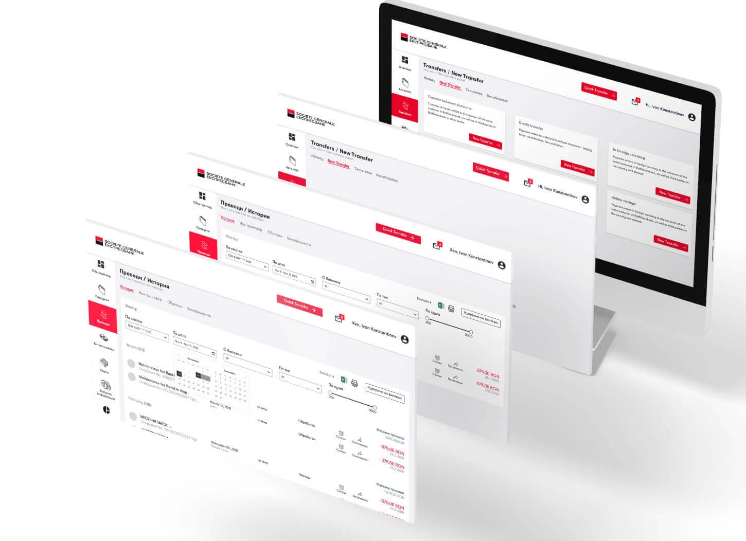
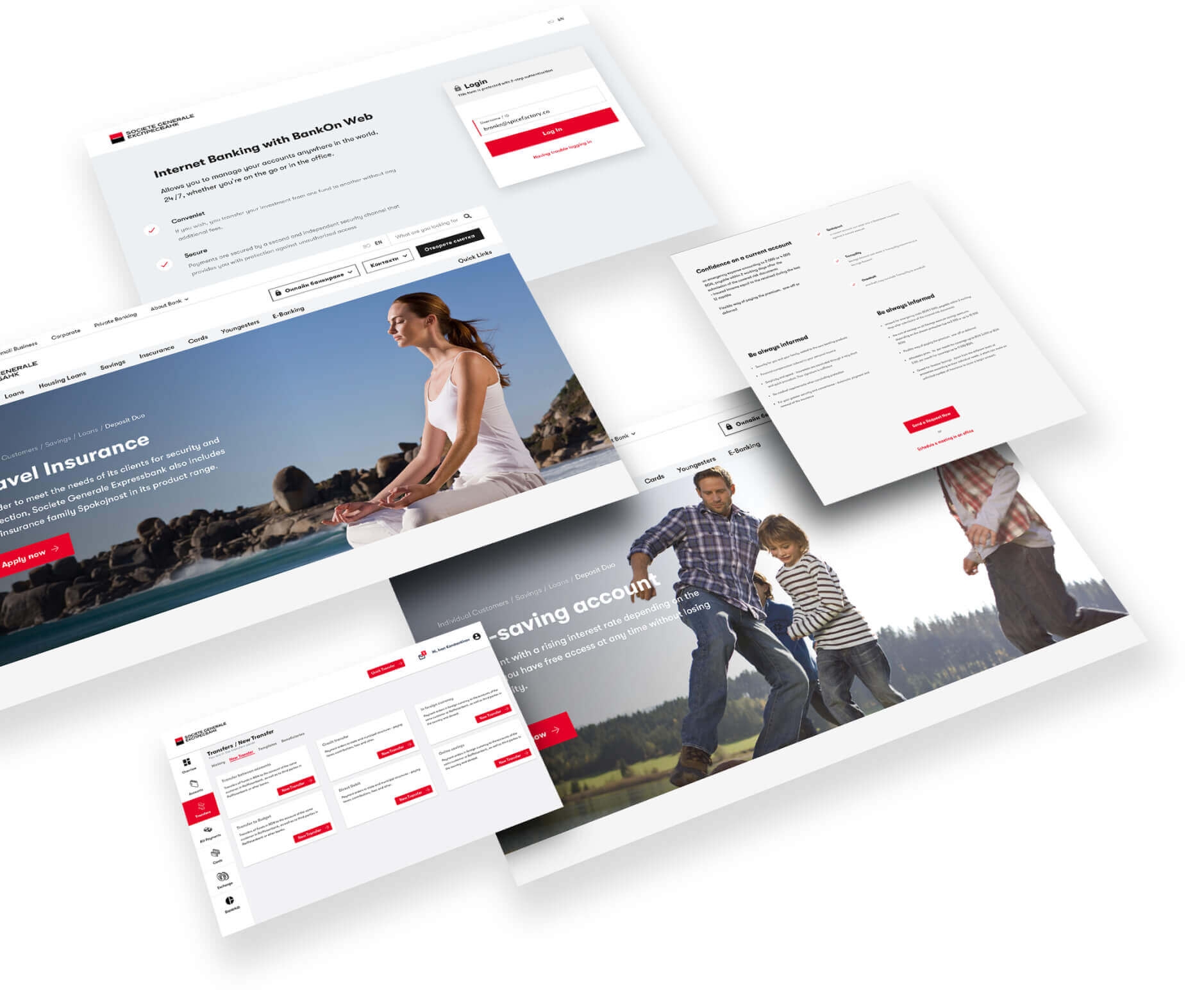
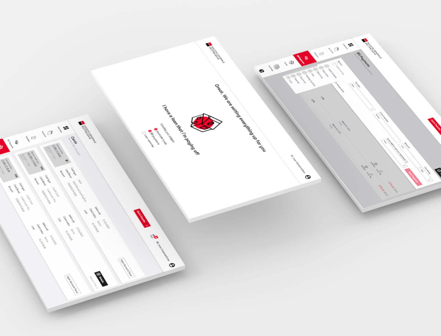
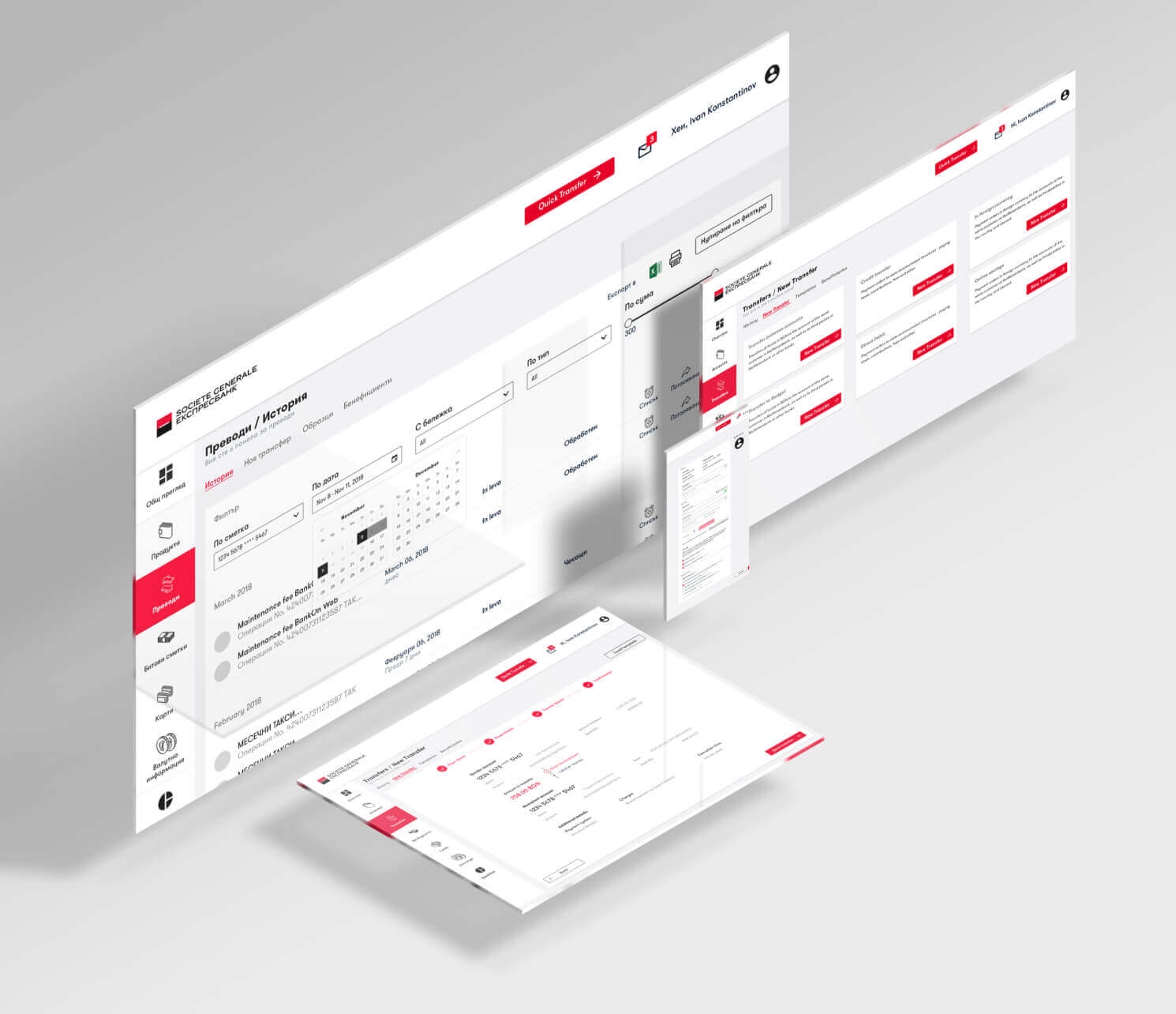
Project Overview
Societe Generale Expressbank approached us to find out what their users struggle with in the existing system and to provide solutions to these problems while keeping in mind their current system architecture and resources.
The goal was to streamline the entire experience that felt impersonal and disjointed, while taking into account rules and regulations that every banking system must adhere to. The bank also wanted to be perceived as modern and the UI had to convey this to the users.
30% of consumers are abandoning the process of opening a new account because it is too complicated or takes too long.
The UX Challenges
The new UX design solution needed to meet customer expectations for a seamless and consistent experience across the bank's multiple digital properties, while supporting the business objectives.
In addition, the design needed to adhere to strict regulatory compliances regarding customer data without inadvertently encouraging abandonment.
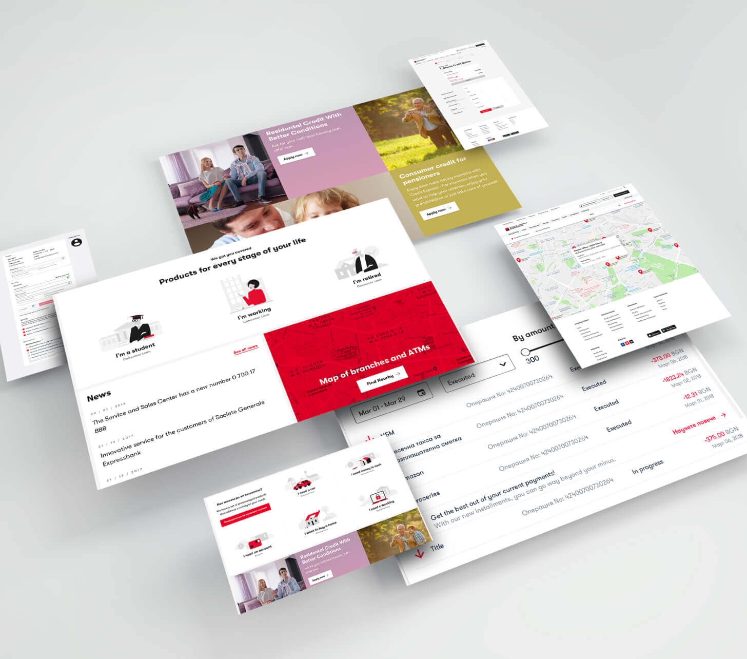
49.4% of the customer interactions with the bank happen digitally, and 88% of users use 2 or more channels when interacting with a bank.
Frost & Sullivan
The UX Audit Process
In order to create a unified customer experience journey across the bank’s digital properties, we first needed to get a deeper understanding of the users.
We separated a broad range of user demographics into three user groups (Digital Native, Stratum, Top Affluent) and performed detailed testing with 5 representatives from each. The result was a detailed user journey for each test scenario and a lot of quantitative data which clearly showed what users struggled with.
Experience design
During the design process, our team created various deliverables that needed to be tested and deployed, including:
- Documented UX strategy, user journeys, and tasks matrix
- Design storyboards and wireframes
- Functional design prototypes for user testing
- Design specification and supporting requirements docs
The design phase produced UX design standards that acted as a starting point for the creation of other materials in-house.
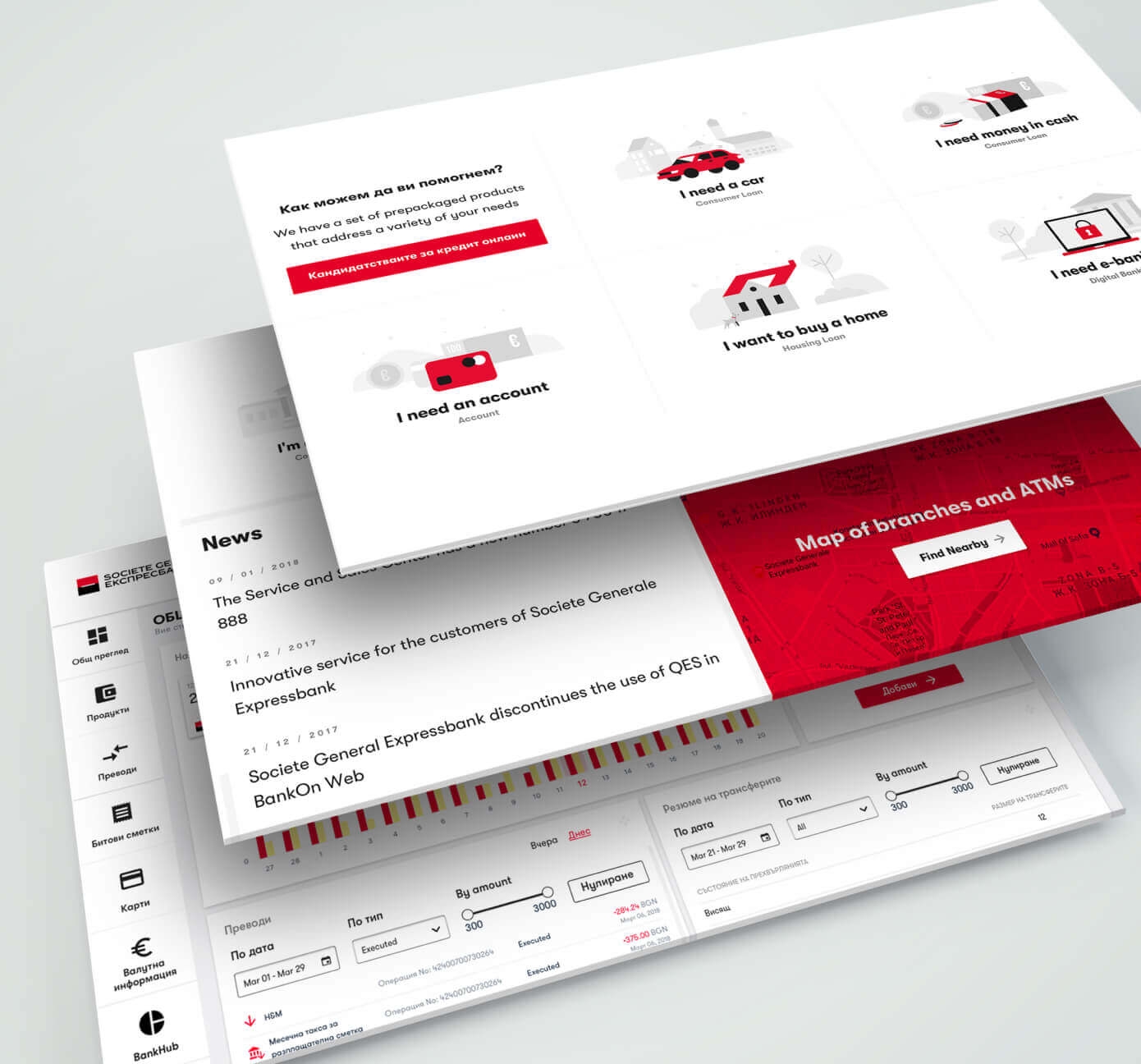
Design iterations
We deployed a series of functional prototypes to selected user groups, measured interaction against predefined standards, and made a series of informed iterations to the UX strategy and product design.
Each iteration had to be redeployed to target groups, and measured for performance. At the conclusion of this iterative process, we were able to deliver a final product design for deployment to the full user base.
The Outcome
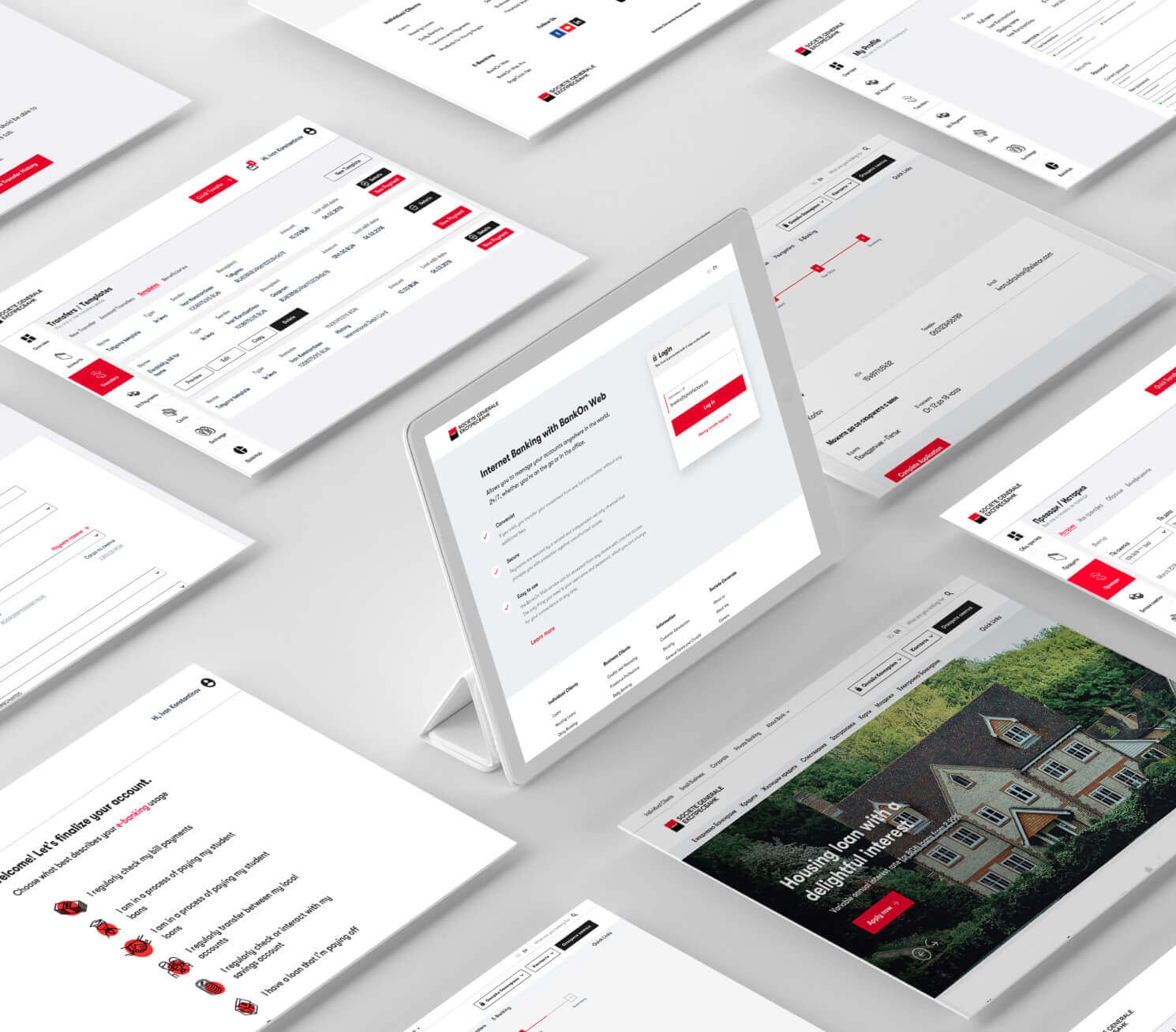
The end result was a UI that reflected the freshness and modernity of the bank. The UI was easy to use and provided great UX that their customers loved and understood how to use efficiently.
