
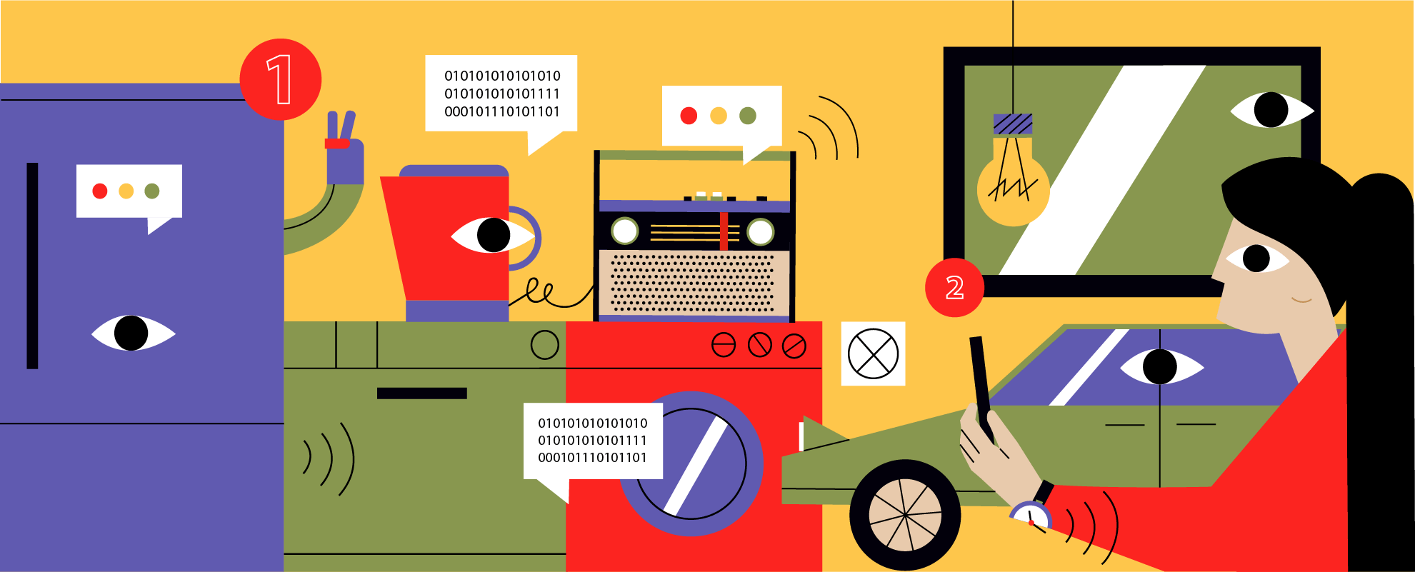
Key UX Considerations When Designing for IoT (2026 Edition)
IoT UX design is the discipline of designing a connected product as one system rather than a set of screens. The 2026 rewrite of our 2017 post: seven considerations, from state models and provisioning to fleet-scale alarm design and AI in the loop, each grounded in a connected platform we shipped.
IoT UX design is the discipline of designing a connected product as one system, the physical device and its companion and web apps and voice surfaces and data and the people who operate it, rather than as a set of screens. The unit of design is the state of an ecosystem rather than an interface: where information lives, how fast it moves, what happens when the network drops, and who has to act when a device misbehaves. Get that right and a connected product feels like one coherent service. Get it wrong and no amount of visual polish saves it.
We first published this article in June 2017, when the hard problem seemed to be that connected devices had "no screen to fall back on." Nine years and three shipped connected platforms later, a clinical intelligence platform built around a smart knee implant, a fleet telematics system processing tens of millions of events a day, and a companion app spanning 20+ generations of mobile hotspots, almost every assumption in that original post has been overtaken. This is the full 2026 rewrite: what changed, and the seven considerations that decide whether a connected product survives contact with the field.
What changed since 2017
The market got big and the problems moved. IoT Analytics expects 21.1 billion connected IoT devices by the end of 2025, up 14% year over year from 18.5 billion in 2024. Scale did not dissolve the UX problems. It relocated them:
| 2017 assumption | 2026 reality |
|---|---|
| "No screen to fall back on" was the novelty | Screenless is normal. The hard problem is state consistency across app, voice, web dashboard, wearable, and physical controls |
| Wi-Fi pairing was the painful part of setup | Matter and Thread standardized commissioning, and the Thread Group passed 1,000 certified products in 2025, yet 52% of DIY smart home users still report setup or connectivity issues |
| Every interaction round-tripped through the cloud | Edge AI made latency and offline behavior designable. "What runs where" is a UX decision now, not only an infrastructure one |
| Wearables meant fitness trackers | Regulated medical wearables and implants, where reimbursement codes make patient-facing UX a revenue line |
| Security was an engineering afterthought | Security is legislated UX: the UK bans universal default passwords, and the EU Cyber Resilience Act is in force |
| One user: the person holding the phone | Three users: the end user, the fleet operator watching 10,000 devices, and increasingly the AI agent acting on the user's behalf |
That last row quietly changes everything downstream of it. Here are the seven considerations, each grounded in a product decision we actually shipped.
1. Design the ecosystem's state, not the device's screen
A connected product's real interface is its state model: what the device believes, what the cloud believes, what each surface displays, and how disagreements get resolved. Users experience every mismatch as a broken product. The thermostat app showing 68°F while the device reads 72°F is not "syncing" to the person looking at it. It is lying. The design goal has not changed since Claire Rowland articulated it a decade ago: the experience should feel synchronous even when it technically is not. What changed is how many surfaces you have to keep honest. Phone, watch, voice assistant, web dashboard, and the physical buttons on the device itself.
In practice that means designing the conceptual model before any screen. What does the user believe happens when they tap a control? Does the command go to the device directly, or through a cloud they may not know exists? Optimistic interfaces that assume success feel fast right up until the first failed command teaches the user that the toggle is a suggestion. The pattern that survives real networks is optimistic display with truthful reconciliation: reflect the intent immediately, mark it in flight, and visibly resolve it, confirmed or rolled back, within a bounded time. Users forgive latency they can see. They do not forgive interfaces that guess.
The deeper version of the problem is time rather than surfaces. When we built the companion app for Novatel Wireless's MiFi hotspots, the brief was not one device. It was 20+ device generations, each with different firmware capabilities and device-specific APIs, all needing to feel like the same product. The answer was architectural: an extensible communication library that abstracts device differences away from the interface, so a settings screen does not need to know which decade its hardware shipped in. Fix once, deploy everywhere, and the user never learns which generation they own. That abstraction layer is UX infrastructure. Nobody sees it, and it is the single decision that most determines whether the ecosystem feels coherent. If you are designing a connected product line rather than a single SKU, this layer is where the experience actually gets designed.
2. Onboarding is your product's first outage
Setup is where connected products die. Parks Associates found that 52% of DIY smart home users report setup or connectivity issues, in 2025, a decade into the smart home era, after Matter and Thread supposedly solved commissioning. The friction did not disappear. It moved from Wi-Fi credentials to network topology, account linking, and multi-admin ecosystems.
The mechanics deserve real design attention, because each provisioning path fails differently. BLE-assisted Wi-Fi provisioning gives you a reliable side channel to the device while it joins the network, and a way to report what went wrong. QR claim codes and Matter commissioning compress identity and network joining into a scan. SoftAP setup, still common in industrial gear, marches the user through switching phone networks mid-flow, which is the single most abandoned step in connected-product setup. And the setting is rarely a living room. Field devices get commissioned on factory floors, in parking garages, at remote sites with one bar of signal, by installers whose technical confidence you cannot assume. Choosing a provisioning path is choosing which failure modes your least-technical user meets in their worst environment.
The engineering vocabulary here, provisioning and commissioning and device claiming, tells you what onboarding really is: a distributed-systems operation performed by an untrained person, usually in the worst radio environment the product will ever see. Four things can fail independently, the device, the phone, the backend, and the network, and the happy path is the least interesting of the sixteen combinations. Teams storyboard the happy path and then discover the other fifteen in support tickets. Budget the design time accordingly. Enumerate the unhappy flows, decide what the user sees in each, and make every failure state recoverable without a factory reset. The test we apply: can the user tell, at every step, which of the four parties is the problem? "Something went wrong" fails that test. "Your hotspot is fine, but it can't reach the internet" passes.
Onboarding is also where trust gets set. The user who limps through a 40-minute setup never fully trusts the product again, and every later glitch confirms the first impression. The one who gets a five-minute guided flow forgives the occasional dropout. First impressions in IoT are not about delight. They are about establishing that the system tells the truth.
3. Offline, latency, and honest system status
Every connected product is an offline product some of the time. The design question is not whether the network drops but what your product does while it is down: which functions keep working locally, which queue, which fail, and whether the interface admits the difference. Offline-first design and graceful degradation are the practitioner terms, but the principle predates IoT by decades. Visibility of system status. A device that silently executes stale commands is worse than one that says it cannot.
Edge computing turned this from a coping strategy into a design space. When inference runs on the device the round trip disappears, so a safety alert does not wait on a cell tower, a voice command does not wait on a region failover, and the product keeps its core promise with the backhaul severed. Deciding what runs on-device and what runs in the cloud is now a joint UX and architecture decision with real cost consequences, and we published the full trade-off with the TCO math in Edge vs. Cloud in IoT: Optimizing Performance and Cost at Scale. For this post the UX rule is enough: put the interactions that define the product's core promise on the edge, let everything else tolerate a round trip, and never let the interface pretend a queued action already happened.
4. Security is now part of the interface
For years, security in connected products was an engineering line item the design team never saw. Regulators ended that. The UK's PSTI product security regime, in force since 29 April 2024, makes the UK the first country to ban universal default passwords on consumer connectable products, which is a law aimed squarely at an onboarding flow. The EU's Cyber Resilience Act entered into force in December 2024, with its main obligations applying from December 2027: mandatory security requirements across the product lifecycle, vulnerability handling, and disclosure of how long a device will receive updates. That last item is a UX artifact, a promise your interface and your update mechanism have to keep for years. The reporting duties arrive sooner. From 11 September 2026, an actively exploited vulnerability in a product you shipped starts a 24-hour clock, and the machine-learning part of that product is the hardest thing to explain inside a day.
We learned to treat security as an onboarding design problem long before it was law. The Novatel guided setup walked every user through securing their hotspot as part of the first-run flow, not a buried settings toggle and not a nag screen, and the result was a 100% default-password change rate across the install base. Nobody reads a security manual. Everybody completes a well-designed first run. Compliance requirements arrive as legal text and ship as interaction design, and the teams that treat PSTI and the CRA as design inputs will build setup flows that pass audits by construction.
5. In regulated products, UX is a safety system
The sharpest change since 2017 is where connected products now live: inside people. Consumer wearables grew up into regulated medical devices, and in that world usability is a controlled risk rather than a quality attribute. IEC 62366-1, an FDA-recognized consensus standard, requires manufacturers to analyze use-related risk and to validate through human factors work that real users can operate the device without dangerous use errors. A confusing interface is formally a hazard. A MedTech buyer says "human factors" where a consumer designer says "UX," and the vocabulary gap is the smaller half of the difference. The larger half is that every design decision needs documented evidence behind it.
Our clearest proof of what that looks like is the recovery intelligence platform we built with Canary Medical around their FDA-authorized smart knee implant. The implant streams six continuous gait signals, steps and distance and walking speed and range of motion and stride length and cadence, through the critical 12-month recovery window. The central design problem was attention, on both sides of the platform. For surgeons, the failure mode of remote monitoring is drowning, because six signals times an entire patient panel is a wall of charts nobody reads. The clinician dashboard inverts it: recovery curves and a predictive risk engine concentrate attention on the roughly 10% of patients whose trajectory needs intervention, while the 90% recovering normally are monitored automatically. For patients, the app's job is adherence. A recovering knee-replacement patient in week six needs to see progress and next steps, not raw telemetry.
In healthcare that patient-facing UX carries a P&L line. Remote patient monitoring is reimbursed under CPT codes 99453–99458, generating $100+ per patient monthly, but only while patients stay engaged and data keeps flowing. Adherence UX is the revenue mechanism, not a retention metric. When a design review can affect patient safety and the reimbursement engine at the same time, "key UX considerations" stops being a listicle topic.
6. The other user: whoever operates the fleet
Consumer IoT design centers the person holding the phone. Industrial and commercial IoT has a second user the generalist playbooks ignore: the operator responsible for thousands of devices at once. Their problems invert the consumer's. The consumer wants to see everything about one device. The operator needs to see almost nothing about ten thousand, except the handful that matter right now.
That is an alarm design problem and it is unforgiving. When we built AutoTrace's fleet telematics platform, the pipeline ingested tens of millions of vehicle events a day: location, engine diagnostics, fuel, harsh-driving events from OBD-II hardware. Tens of millions of events is not tens of millions of notifications, and the entire design is the funnel between those two numbers. Configurable alert rules decide what counts as critical, a geofence breach or a diagnostic fault or a harsh-braking pattern, and those few events reach dispatchers over WebSocket in seconds while everything else aggregates quietly into driver scorecards and trip replays that answer questions when asked. Alarm fatigue is not a UX nicety. An operator who has learned to ignore the alert stream has turned your safety system into decoration.
Designing for the operator starts with admitting they exist. Most connected-product teams never meet the dispatcher who will live in their dashboard eight hours a day, and it shows: consumer-grade card layouts where a triage queue belongs, celebratory empty states in a tool whose empty state means the fleet is healthy, no keyboard path through a workflow someone repeats two hundred times a shift. The operator persona has its own research agenda, and shadowing a shift teaches you more than any usability lab. It also has its own success metric: time from anomaly to correct human action.
Fleet operations reprice failure, too. In consumer software a bad release means a bug report. In a device fleet, a botched update can mean a technician driving to every site, the dreaded truck roll, so over-the-air updates are risk management with an interface: staged rollout waves, canary cohorts, automatic rollback, and an operator view showing exactly which wave is running and how to stop it. If your connected vehicle platform does not give the operator a big obvious way to halt a rollout, you designed the demo.
7. AI in the loop, human on the trigger
The newest consideration did not exist when we wrote the original post. AI has reached the interaction layer of connected products, with Gartner projecting 33% of enterprise software will include agentic AI by 2028, up from under 1% in 2024, and IoT is where that trend meets physical consequences. A chatbot that hallucinates wastes your time. An agent that acts on a device changes the physical world: a dosage, a valve, a vehicle.
The interaction pattern we hold to is simple. AI recommends, a human confirms, the device acts. Where the loop closes automatically, two properties are non-negotiable: a small blast radius, so a wrong action cannot propagate across a fleet or harm a patient, and reversibility, so any automated action can be undone by the person nominally in charge. Canary's predictive risk engine is the pattern in miniature. It flags the at-risk recovery trajectory and a surgeon decides what happens next. The model concentrates attention; the human owns the intervention.
Regulators are converging on the same split. The FDA's January 2025 draft guidance on AI-enabled device software functions puts transparency, human factors, and lifecycle change management at the center of what it expects from AI in devices. In interface terms: show the user what the model saw, what it inferred, and how to override it. Design AI features so those answers are legible and you are building a better product and the evidence a regulator will ask for at the same time.
What we'd tell a 2026 team designing for IoT
The 2017 post ended with "prototype, test, iterate." Still true, still insufficient. Here is the version we would hand a team today.
- Design the state model first. Screens are projections of state, and if the ecosystem's state model is wrong, every surface inherits the lie.
- Spend design budget on the unhappy flows. Onboarding is a distributed-systems operation run by a novice, so enumerate the failure combinations and make each one recoverable and honest.
- Decide what works offline on purpose. Put the core promise on the edge and never let the UI pretend a queued action already happened.
- Treat regulation as a design input. PSTI, the CRA, IEC 62366-1, and the FDA's AI guidance all specify how the product has to behave in front of a user, and teams that design to them ship faster rather than slower.
- Design for the operator. The funnel from millions of events to a handful of trustworthy alerts is the product.
- Keep a human on the trigger, and keep everything automated reversible.
- Earn trust in the first five minutes. A truthful guided first run buys forgiveness for every later glitch, and a broken one is never forgotten.
IoT UX stopped being a screen problem and became a systems problem: state, failure modes, attention, accountability, all designed deliberately. Which is also why the discipline migrated from design studios toward teams that ship the whole stack. You cannot design honest system status without owning the system.
If you are building a connected product where the stakes are regulated, a medical wearable or a vehicle platform or an industrial fleet, that systems work is what we do, from UX through deployment. See how our engagements are structured. Or pick the assumption about your product's state model that would hurt most if it turned out to be wrong, and scope a First Build to find out in weeks instead of quarters.
Related Insights

Insight
Edge vs. Cloud in IoT: Optimizing Performance and Cost at Scale
Scale your IoT ecosystem with precision. Learn how to balance Edge and Cloud computing to optimize performance, slash costs, and ensure mission-critical responsiveness at scale.
Read More
Insight
Voice - Our New Interface for Everything?
Voice tech is booming, but are we ready to ditch screens? Explore the reality of VUI adoption and why the shift to a voice-first world won't happen overnight.
Read More
Insight
Powering Connected Fleets: The Art & Science of Telemetry Systems
From horsepower to data power: discover how to build scalable telemetry systems for connected fleets. Harness GPS and CAN bus data for safer, efficient operations.
Read More
Insight
From Robotics and AI to 3D Printing: A Q&A on New Technologies with our CEO
From sci-fi dreams to reality: Explore the impact of AI, robotics, and 3D printing in this exclusive Q&A with our CEO. Discover how emerging tech improves our lives.
Read MoreFacing a problem like this one?
Tell us what the business needs to win and who owns it on your side. If it is a fit, a First Build starts within weeks. If it is not, we will tell you why.