
Design
Design for the person on the other side of the screen.
A nurse between two patients. A driver in the snow. A customer halfway through opening a bank account. We study what they do, design for it, and build what we designed.
Measure behavior, not opinions.
It starts with empathy.
Our design practice has one founding question. Dragana Krtinic, our Chief Design Officer, first asked it in a talk to a room of engineers.
The answer shaped how we work. Designers sit in the research sessions. Engineers watch the recordings. Nobody gets to design for a user they have not met.
Doesn’t user experience mean knowing how users feel? And to know how people feel, don’t you need intuition? To grow your intuition, don’t you need empathy?


Does any of this matter here?
But wait.
Knowing how people feel is the job.
Keep it humane.
Four lines we keep coming back to.
Each one is a line from something we published. They still settle arguments here.
- 01
Keep it humane!
User experience means knowing how people feel. A product that is kind to a tired, distracted, or anxious person is a product that works.
From: Empathy-Driven Design: What Engineers Need to Hear - 02
Measure behavior, not opinions.
People describe one product and use another. We watch the session, read the heatmap, and count who finishes. Approval in a meeting is not validation.
From: Prototyping is About Validation - 03
Never leave your users in the dark.
Empty screens, slow connections, and errors are part of the product. Each one tells the person what is happening and what to do next.
From: Embracing the State of Emptiness - 04
A confusing interface is formally a hazard.
In a clinic, a vehicle, or a bank, usability is a safety and compliance matter. The required field and the regulator's disclosure are designed, not bolted on.
From: Key UX Considerations When Designing for IoT
Four questions about the people who use your product.
- 01
What motivates them?
Interviews, personas, jobs to be done
What the person is trying to get done, and what they would do if your product did not exist.
- 02
How do they behave in the product?
Usability sessions, heatmaps, analytics
Where they look, what they tap, and what they never find. Recorded, so the whole team sees it.
- 03
Where do they drop off, and why?
Journey maps across every channel
The step where a customer gives up is usually a step nobody on the team owns.
- 04
What makes them use more of it?
Prototypes tested each iteration
The change that earns trust is tested with real users before anyone builds it.
Find what is in the way. Then remove it.
An audit is an outside read of your product, grounded in evidence from the people who use it. There is no single right way to run one. This is what ours contains.
IMPORTANT: Complete ALL fields. Incomplete applications will be rejected.
7 errors found. Please review the form and resubmit.
Step 2 of 4
Where do you live?
Full legal name (as on ID)*
SSN / ITIN*Invalid
DOB (MM/DD/YYYY)*Invalid
Residential address line 1*Residential address
214 Maple Street, Boston, MA
Looks good
Address line 2
ZIP+4*Invalid
Tax residency (see Form W-9)*Invalid
Source of funds code*Invalid
Employment status code*
Gross monthly income (USD)*Invalid
PEP declaration (Y/N)*Invalid
Promo code
Tax residency set to match your address. Change
ResetSave draftSubmit applicationContinue
Findings
- Progressive disclosureBefore: Twelve fields at once, before the customer knows why.After: One question at a time. Only what this step needs.
- Progress indicatorsBefore: No sign of how much is left, or what happens next.After: The customer always knows where they are and what is next.
- Inline validationBefore: An error count after submit, and no word on how to fix any of them.After: Each answer is checked as it is given.
- Smart defaultsBefore: The customer retypes what the bank already knows.After: Known answers are filled in, and stay editable.
- 01
Research
User research aligned with what the business needs: who the users are, what they came to do, and where the product fails them.
- 02
Heuristic review
Every key screen and flow read against established usability principles, accessibility included.
- 03
Usability testing
Representative users work through real tasks, in person or remote. We watch what they do.
- 04
Benchmarking
Your product next to the ones your customers compare it with.
- 05
The report
The issues, the evidence behind each, and recommendations that were tested. Presented in the room, not mailed over.
When teams ask for one
Before a redesign
A new product is not performing
The user base has to grow
Then we design it, and build it
An audit ends with a report. Most of our partners keep going: user journeys, wireframes, prototypes tested at each iteration, and a design system the next product can start from. The team that designed it ships it.
From a UX audit to a design system the bank runs on.
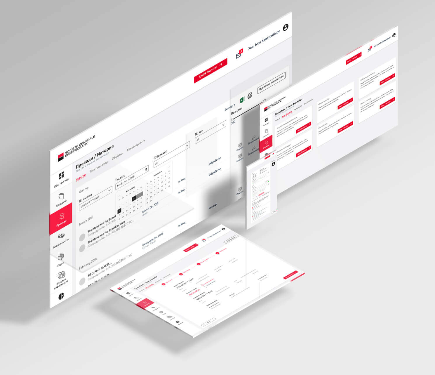
30% of customers were abandoning account opening. The bank asked for a complete audit of its website, online banking, and mobile banking, and then for the redesign.

01Audit
Every screen, annotated.
We audited the website, online banking, and mobile banking page by page, then put representative customers in front of them. In testing, 60% of participants could not find the loan calculator on the homepage.

02People
Three groups of customers, tested separately.
Digital Native, Stratum, and Top Affluent customers use a bank differently and trust it differently. Each design iteration was tested with all three.

03Journey
The drop-off, mapped across channels.
Journey maps followed customers across web, mobile, and branch, and marked the steps where they lost confidence and left.
04Prototypes
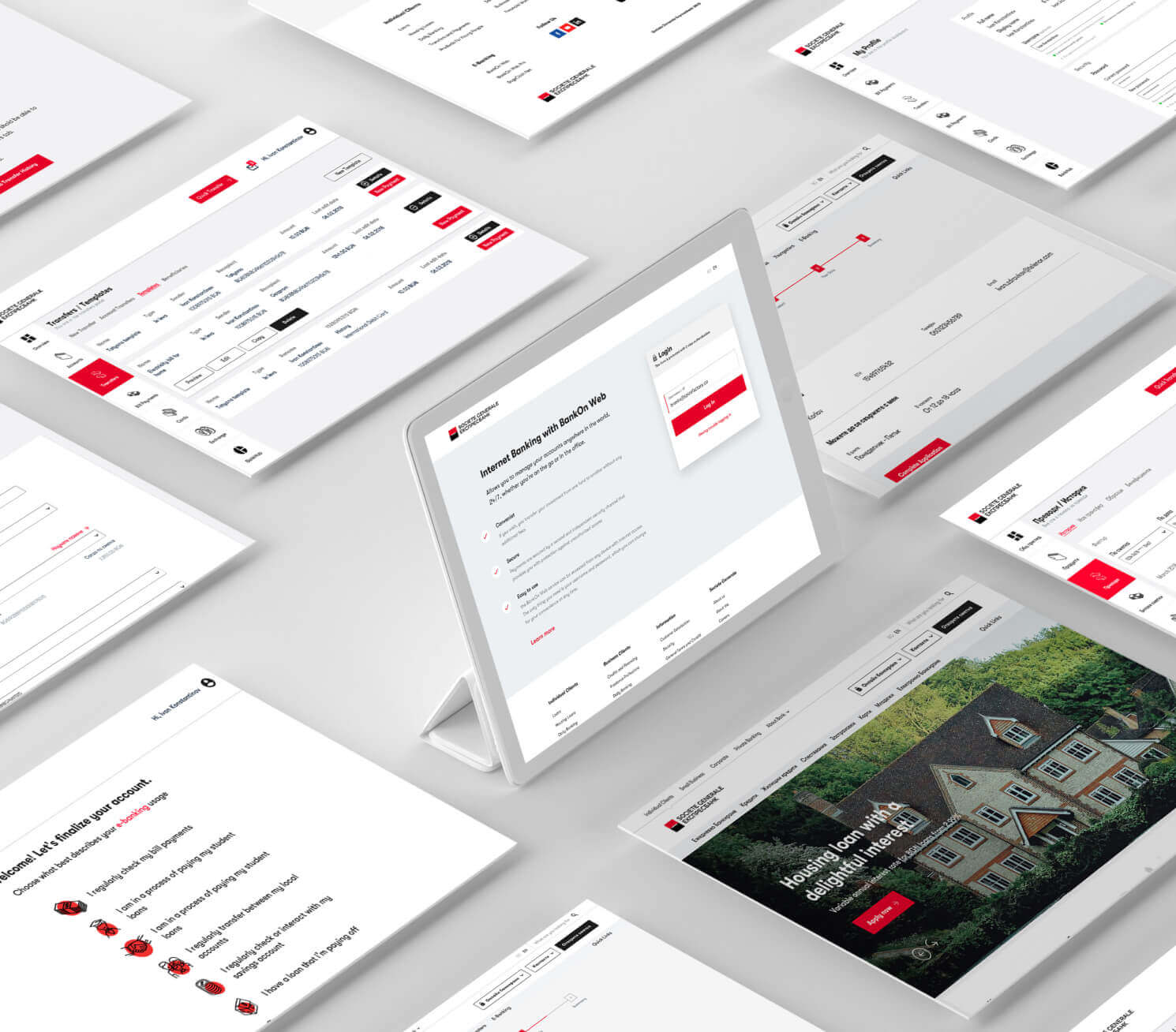
Wireframes and prototypes, tested each round.
Progressive disclosure shows only what each step needs. Smart defaults fill in what the bank already knows. Progress is always visible, and errors are caught before submission.

05System
One design system for every channel.
A component library with documentation and accessibility built in, interaction patterns, and content standards for voice, tone, and microcopy. Regulatory fields and disclosures are part of the design.
What changed
For customers
The redesign removed the steps that lost them, and more customers now finish account opening. The experience is consistent across web, mobile, and branch.
For the business
More completed account openings from the same traffic, and fewer support calls caused by confusion.
For the bank's teams
Design standards and a reusable component library that every later digital property starts from.
Design where a mistake costs more than a click.
The method does not change with the industry. The person on the other side does.






In their words
“Users already have a mental model for car remotes. We designed around the fob they already know—not some novel interface.”
Geoff, VP at Viper
What we have written down.
The practice, in our own words. Start anywhere.
Research and validation
- True validation comes from users who see real value from using your product.Your Stakeholders Approved the Design. Your Users Didn't.
- There’s no single right way to conduct a UX audit.What Is a UX Audit and Does Your Product Need One?
- Jobs to be done are not strictly functional - the users will have emotional and social drivers for completing these jobs.Jobs-to-Be-Done: The UX Framework That Changes Everything
Clarity
- The more important something is, the more prominent it should be.Your Users Decide in Seconds — Visual Hierarchy Is Why
- Just be helpful and move out of their way.Every Word in Your Product Is a Design Decision
- There’s no way around it - you need a good IA in order to have a good UX.Bad Information Architecture Is Invisible — Until Users Leave
Trust and safety
- The root of this insecurity was in the lack of trust.Building Trust in Digital Banking Through UX
- Users forgive latency they can see. They do not forgive interfaces that guess.Key UX Considerations When Designing for IoT
- Privacy and safety aren’t just checkboxes, they’re part of the user experience.Designing with Constraints
Systems and handoff
- It’s no longer about creating beautiful one-off solutions.Here's Why You Definitely Need a Design System
- Bad implementation is usually perceived as bad designWhy Your Designers and Developers Keep Talking Past Each Other
- And the earlier in the design process you start, the better!Accessibility Isn't a Checklist — 5 Things We Got Wrong First
Before you ask.
What do we get from a UX audit?
A report that names the main issues, shows the evidence behind each one, and gives recommendations that were tested with users. We present it to your team in person and agree what to fix first.
Do you only audit, or do you also design and build?
Both, and for most partners all three. At Société Générale Expressbank the work ran from the audit through tested prototypes to a design system. On the products we run for years, the team that designs a screen also ships it and answers for what it does in production.
Our product is regulated. Does that limit the design?
It shapes it. Required fields, disclosures, consent, and audit trails are design inputs from the first wireframe, and accessibility is built into every component. The banking redesign met its regulatory requirements without making account opening harder.
Who do you test with?
People who represent your real users, recruited for each group that uses the product differently. We include people who have never used it, because existing users have already learned to live with its problems.
How does it start?
With a conversation about what the business needs to win and who owns it on your side. The first engagement is a First Build with a fixed price. How we partner explains the shapes that follow.
Let's talk
Whose day should your product make easier?
Tell us what you are building, what the business needs to win, and who owns it on your side. A founder reads every message and answers within two working days, including when the answer is no.